
There is one thing in design that I find fascinating yet remains an enigma to me – fonts. The right fonts will ignite the right message, and when it comes to logos, posters or advertising, a clear, sharp and easy to read font is a must.
See More ▼ 5 Sites With Free Fonts For Commercial Use For Typeface Enthusiasts
With my many years in studying fonts, identifying them whenever I go out and having the passion in collecting MontBlanc pens, fonts are one of the loves of my life. You can trust me on these 10 recommendations. They are perfect for big, bold and beautiful headline titles. Most of them are commercial fonts, however the free fonts listed below can be downloaded from Google Fonts.
As for Helvetica, Garamond and Myriad (Apple’s Favorite), they too are very beautiful fonts. The reason they are not in the list is because they are somewhat too common, there is no point pointing out the obvious.
*Skip to 4:48 for a very good presentation on why fonts design matters.
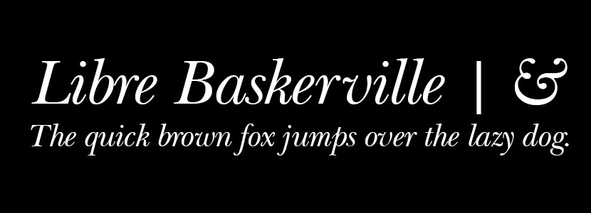
↑ The most beautiful thing about this font is the style of the Ampersand. Libre Baskerville (Free | Classic, Stylish, and Opulence) is a Transitional serif typeface designed by John Baskerville in 1757. It has a very elegant classical touch to it. Ideal for weddings related cards and posters.
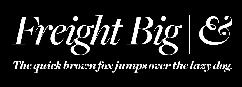
↑ Not to be confused with Freight Text, Freight Big (Exclusive, Elegant, and Mystique) is a display version of the typeface Freight Text meant to be used at extremely large sizes. Just like Baskerville, the Ampersand is beautifully crafted. It has a folding ribbon style.
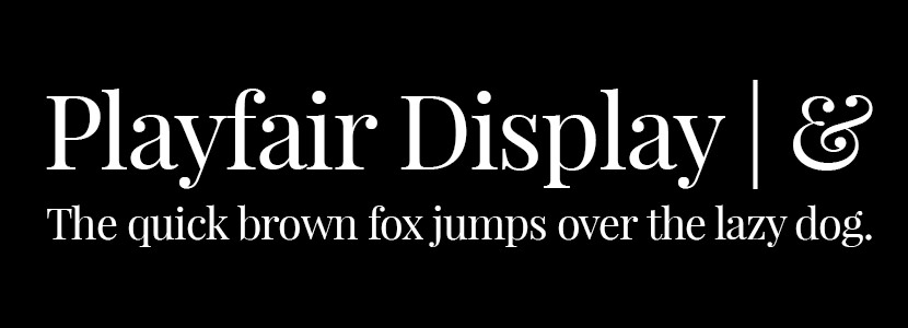
↑ The Ampersand is again the main attraction, unlike the other two, Playfair Display (Free | Classy, Elegant, and Respect) is an open-source font designed by Danish type designer Claus Eggers Sørensen in 2011. The design is influenced by typefaces from the mid to late eighteenth century, such as Baskerville. It has a very elegant look and feel to it, ideal for magazine portraying an exclusive image.
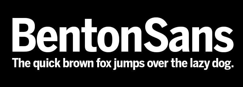
↑ Benton Sans (Reliable, Trustworthy, and Confident) is a digital typeface family begun by Tobias Frere-Jones in 1995, and expanded by Cyrus Highsmith of Font Bureau. In my own opinion, this is perhaps the best font for large text in posters. Reason being that they are simple and easy to read from near and far. Ideal for big headlines to capture attention.
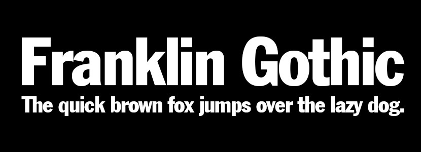
↑ Just like Benton Sans, Franklin Gothic (Bold, Strong, and Confident) is a grotesque sans-serif typeface designed by American type designer Morris Fuller Benton in 1902. The font was named after Benjamin Franklin. The design has a very classic newspaper feel to it. Ideal for serious editorial usage.
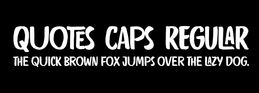
↑ Quotes Caps (Playful, Happy, and Hipster) is a very unique handwriting fonts. As someone that toyed with hundreds of ‘Writing Style’ fonts, most of them are either too childish or too messy. Quotes Caps on the other hand was able to balance the best of both worlds, the most important aspect of this font is it is easy to read in a long paragraph.
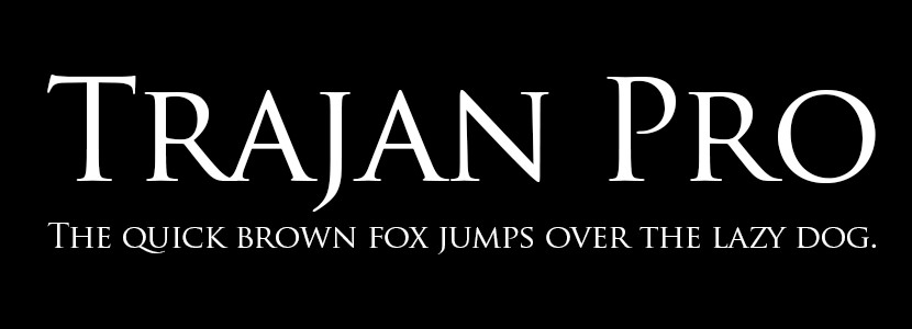
↑ Owned by Adobe, if you subscribed to any of their services, the font is available for your usage. Trajan Pro (Upper-Class, Elite, and Posh) is a very unique font, in the sense that it has this Roman feel to it. The TrajanTM design is a serif font with elegant, sweeping curves and due to its Roman typography inspiration is consequently an upper-case only font family. This typeface can be seen with the infamous Tiffany & Co logo.
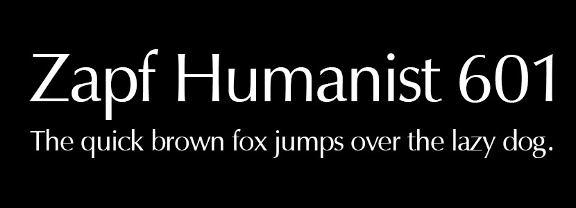
↑ Some typefaces are mysterious, like the Zapf Humanist 601 (Mysterious, Warm, and Enigma), its origins are an enigma wrapped within a riddle, indeed. While its letterforms may be shrouded in secrecy, this design is sure to make a fine addition to your typographic arsenal, so they recommend you go try it out. There is this human life figure in them that brings it to life.
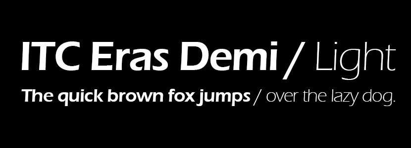
↑ Designed through the collaboration of two French designers, Albert Boton and Albert Hollenstein, ITC Eras (Lively, Charming, and Unique) has charm, distinction, and a lively quality rarely seen in sans serif typefaces. It has a strong personality; you won’t find self-effacing, function-over-form designs like Helvetica or Century Schoolbook among them. Instead, French types are usually lively faces that add sparkle to a block of text copy or a display headline. ITC Eras is easy to read in blocks of text copy, and can be an excellent choice for brochures, ads, posters, menus and package design.
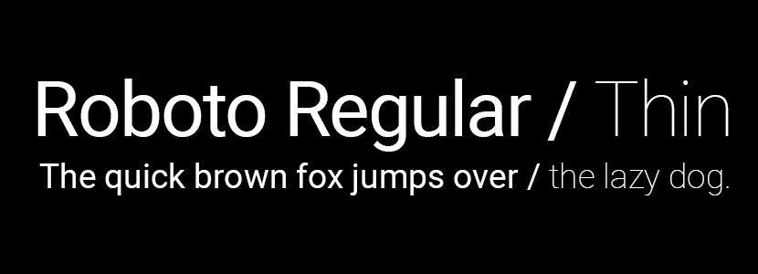
↑ Roboto (Free | Modern, Approachable, and Emotional) is a neo-grotesque sans-serif typeface family developed by Google as the system font for its mobile operating system Android. Roboto has a dual nature. It has a mechanical skeleton and the forms are largely geometric. At the same time, the font features friendly and open curves.
Don’t u have Hindi calligraphy fonts